.svg)
This proposed educational support app aims to bridge the gap between parents and students in the classroom to best support students in exploring careers and opportunities in the tech industry.
.jpg)
Through deep analysis of primary interviews with key stakeholders (parents, teachers and students) a lack of parental involvement was highlighted as the main challenge and barrier. Causes of this include:
Language Barriers - Parents come from a variety of backgrounds where English is not the first language, requiring extra steps for meaningful communication.
Knowledge Gap - Many parents do not have a background in tech which makes following with classes and pursuing extra curriculars difficult and intimdating.
Parent-Teacher Relationship - Large class sizes, limited resources and busy schedules cause friction in creating and maintaining a productive parent teacher relationship.
Using the specific issues as a guideline, a solution criteria was developed
The application would need to feature:
Communication System - A simple system that allows parents and teachers to speak outside of class, able to handle multiple languages with ease.
Academic Resources - Some academic resources to help simpliflyl the process by keeping everything in one place,
Relevant Information - Curated information designed to educate parents enough to connect with students learning.
Simple Information - Information presented in such a way that busy parents are able to stay up to date without being overwhelmed.
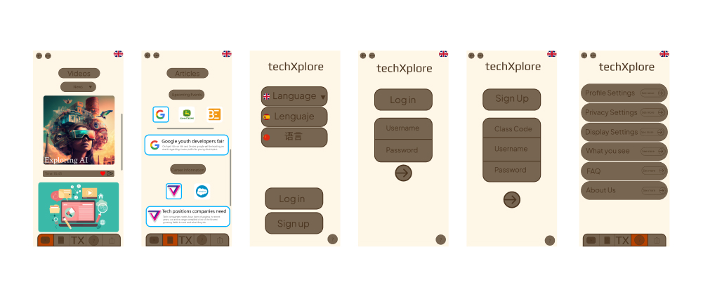
The original time frame for this project was 7 weeks, the bulk of the time being spent on research. It was also my first time using Figma which explains the lackluster design. As my skills and knowledge grew I felt inspired to refine this project to reflect my growth in UX Design.
While the first design was lacking in many areas it provided a proper design foundation by pointing out specific issues that when addressed would lead to a much better design.
Lack of visual clarity - No visual hierarchy makes it hard for users to priortize information. App feels randomly strewn together.
Lack of key features - No ability to communicate with teachers, no academic resources, informational videos unclear.
Nonintuitive navigation - Pages don't connect with each other in a way that makes sense to the user. Icons are hard to understand
Overwhelming presentation of information - Resources do not have a distinct page or area making it hard for the user to access what they want in an efficient manner.
Parents need a straightforward way to stay informed about their child’s education without feeling overwhelmed by technical jargon, the design and aesthic of the app must reflect this.
The design must be intuitive, easy to navigate, and visually clear to cater to users with varying levels of tech proficiency.
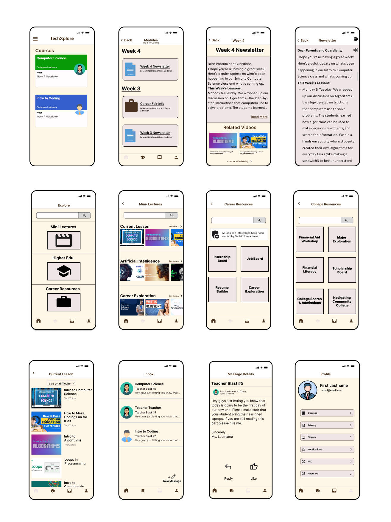
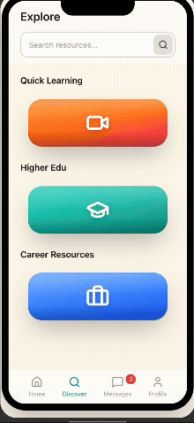
I redesigned the interface to prioritize simplicity, with an emphasis on clear labeling, icons, and an easy-to-understand layout.
Uniform UI - Each page follows a simple design pattern, which improves visual clarity and makes the app feel more cohesive thus enriching user experience.
Key features implemented - Parents can communicate with teachers, quick learning videos accompanied with academic and career resources.
Intuitive navigation - Clear, distinct icons and sections for each resource and page, reducing confusion and improving usability.
Simplified user flow - Parents can quickly access relevant information about their child’s academic career and teacher communication.
The redesign is much better than the initial mockup but there is still room for improvement. I utilized AI tools Figma Make and Claude in order to get it picture perfect.
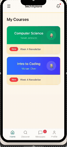
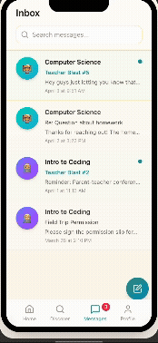
The core of the app is strong but it needed an improvement so that the information that the app is providing feels more official.
Refined UI - 3D icons, clean iconography and meaningful coloring give the app a modern aesthetic that makes sense for a education and tech based app. The user can now feel more confident and trusting that the information is authentic and complete.
Throughout this case study I learned that a designer's job is truly never finished. If the users and designers both care about a product there will always be room for improvement.
For example, the current design for the quick learning might be overwhelming for the user due to the amount of potential videos. Perhaps a Tik-Tok style feed based on the current lesson would improve the experience for the user.
All of this would be contingent on how users feel about the product which is the ultimate guiding force.
